If you're still serving JPEG and PNG as your primary image formats in 2026, you're making your users download more data than they need to. WebP has been broadly supported for years. The conversion tooling is mature. The HTML fallback pattern is a one-liner. There's no good reason to wait.
What WebP Actually Is
WebP is an image format developed by Google, released in 2010. It supports lossy and lossless compression, a full alpha channel for transparency, and animation — covering every use case that JPEG, PNG, and GIF handle individually, in a single format.
The compression derives from VP8, Google's video codec. For lossy images, WebP uses predictive coding: each pixel's value is predicted from neighboring pixels and only the difference is encoded, then compressed with Huffman and arithmetic coding. The result is meaningfully better than JPEG's 30-year-old DCT approach.
For lossless, WebP uses a separate algorithm that includes color transformation, spatial prediction, color indexing, and LZ77-based compression. PNG is also lossless, but WebP lossless typically produces files 26% smaller.
The Size Numbers
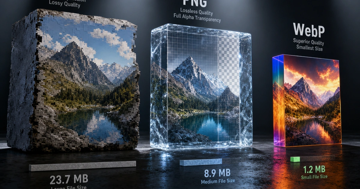
These aren't theoretical. Google published benchmark data comparing WebP to JPEG and PNG at matched quality levels:
- WebP lossy: 25–34% smaller than JPEG at equivalent SSIM quality scores
- WebP lossless: 26% smaller than PNG on average
- WebP animated: 60–80% smaller than GIF for equivalent animations
The savings vary by image content. Photographs with complex textures compress less dramatically than images with large uniform areas. But on a real website image library, 30% average savings is a reasonable expectation for switching from JPEG to WebP.
What does that mean in practice? A product page with 10 images averaging 150KB each — 1.5MB in JPEG — becomes roughly 1MB in WebP. Over thousands of page loads, that's measurable impact on load time, bandwidth costs, and Core Web Vitals scores.
Browser Support: The Objection That No Longer Applies
The historical argument against WebP was browser support. That argument is over.
- Chrome: supported since version 23 (2013)
- Firefox: supported since version 65 (2019)
- Safari: supported since iOS 14 and macOS Big Sur (late 2020)
- Edge: supported since Chromium-based Edge (2020)
- Samsung Internet, Opera: supported
Global WebP support is above 97% of browsers — caniuse.com keeps the live numbers. The remaining 2–3% is dominated by old iOS Safari (pre-14) and very old desktop browsers. If you need to support those, use the <picture> fallback pattern below. If you don't, serve WebP directly.
Converting: Three Approaches
CLI with cwebp
Google's cwebp encoder is the reference implementation. It's available via package managers on all platforms.
# Basic conversion
cwebp input.jpg -o output.webp

# Set quality (0-100, default 75)
cwebp -q 80 input.jpg -o output.webp

# Lossless mode (for PNG equivalents)
cwebp -lossless input.png -o output.webp

# Batch convert all JPEGs in a directory
for f in *.jpg; do cwebp -q 80 "$f" -o "${f%.jpg}.webp"; done
Sharp in Node.js
Sharp is the standard image processing library for Node.js. It wraps libvips and handles WebP conversion efficiently, even at scale.
import sharp from 'sharp';

// Convert JPEG to WebP
await sharp('input.jpg')
  .webp({ quality: 80 })
  .toFile('output.webp');

// Convert PNG to lossless WebP
await sharp('input.png')
  .webp({ lossless: true })
  .toFile('output.webp');

// Batch conversion
import { glob } from 'glob';
import path from 'path';

const files = await glob('images/**/*.{jpg,jpeg,png}');
await Promise.all(files.map(async (file) => {
  const outPath = file.replace(/\.(jpg|jpeg|png)$/, '.webp');
  await sharp(file).webp({ quality: 82 }).toFile(outPath);
}));
In the Browser
The Image Convert tool converts images to WebP directly in your browser — no server round trip, no software to install. Upload a JPEG or PNG, pick WebP as the output format, and download. Useful for one-off conversions and for checking what a converted file will look like before committing to a batch process.
Serving WebP with HTML Fallback
The <picture> element (documented on MDN) lets you serve WebP to browsers that support it while falling back to JPEG or PNG for the rest.
<picture>
  <source srcset="photo.webp" type="image/webp">
  <img src="photo.jpg" alt="A descriptive alt text" loading="lazy" width="800" height="600">
</picture>
Browsers that support WebP pick the <source> element. Browsers that don't fall through to the <img>. The type="image/webp" attribute is the key — the browser uses it to check format support before requesting the file.
For responsive images, combine WebP sources with srcset and sizes — see web.dev's responsive images guide for the full pattern:
<picture>
  <source
    type="image/webp"
    srcset="photo-400.webp 400w, photo-800.webp 800w, photo-1200.webp 1200w"
    sizes="(max-width: 600px) 100vw, 800px">
  <img
    src="photo-800.jpg"
    srcset="photo-400.jpg 400w, photo-800.jpg 800w, photo-1200.jpg 1200w"
    sizes="(max-width: 600px) 100vw, 800px"
    alt="Description"
    loading="lazy"
    width="800"
    height="600">
</picture>
This is verbose but covers every case: format selection, responsive sizing, and fallback. Most modern frameworks (Next.js, Nuxt, Astro) handle this automatically via their image components.
WebP in CSS Background Images
CSS doesn't have the <picture> element's built-in fallback mechanism. The cleanest approach uses the .webp class on <html>, set by a feature detection script:
// Detect WebP support and mark the document
const img = new Image();
img.onload = img.onerror = () => {
  document.documentElement.classList.toggle('webp', img.height === 1);
};
img.src = 'data:image/webp;base64,UklGRiQAAABXRUJQVlA4IBgAAAAwAQCdASoBAAEAAQAcJZACdAYO/gHOAAA=';
Then in CSS:
.hero {
  background-image: url('hero.jpg');
}

.webp .hero {
  background-image: url('hero.webp');
}
Alternatively, use @supports for a CSS-native approach, though browser support for image format detection via @supports is less reliable than JavaScript detection.
In practice, if you're targeting modern browsers (97%+ global coverage), you can often just serve WebP directly as CSS backgrounds without fallback logic.
Common Conversion Mistakes
Setting quality too low. WebP quality 75 is not equivalent to JPEG quality 75 — WebP achieves better results at lower quality numbers. A WebP at quality 80 often looks better than JPEG at quality 85 while being smaller. Don't blindly match quality numbers. Check the visual output.
Forgetting lossless for transparency. Converting a PNG with transparency? Use WebP lossless or set the preserve-alpha option. Lossy WebP with transparency works but may degrade edges around transparent areas.
Converting already-lossy files. Converting JPEG to WebP transcodes from one lossy format to another, compounding quality loss. If you have original source files (RAW, TIFF, high-quality master JPEGs), start from those. If you only have JPEGs, the quality loss from transcoding is usually acceptable but not zero.
Not setting explicit dimensions. When serving WebP with <picture>, keep width and height attributes on the <img> element. These attributes let the browser reserve layout space before the image loads, preventing layout shift and improving Cumulative Layout Shift (CLS) scores.
AVIF: The Next Step
WebP is the right default today. AVIF is the next upgrade when you can afford it.
AVIF compresses 40–50% better than JPEG and 20–30% better than WebP at matched quality. It's based on the AV1 video codec and supports HDR, wide color gamut, and everything WebP does. Safari 16+ (2022) and all modern Chrome and Firefox support it.
The barrier is encoding speed — AVIF encoding is 5–10x slower than WebP, which makes batch conversion more expensive. For a typical web deployment, a common approach is AVIF with WebP fallback:
<picture>
  <source srcset="photo.avif" type="image/avif">
  <source srcset="photo.webp" type="image/webp">
  <img src="photo.jpg" alt="Description" loading="lazy">
</picture>
Read Image Formats Explained for the full comparison of when each format wins.
Wrapping Up
The migration from JPEG and PNG to WebP is well-established. Convert with cwebp or Sharp, serve with the <picture> fallback, and you'll see measurable page weight reduction with no visible quality loss. For individual file conversion, Image Convert handles it directly in the browser, and Image Compress lets you tune quality until the size/quality tradeoff lands where you need it.
FAQ
Do I still need a JPEG fallback in 2026?
For most public-facing sites, no — WebP support is at 97%+ globally and the holdouts are typically older corporate browsers or Safari versions before iOS 14 (released late 2020). If your analytics show meaningful traffic on those, keep the fallback. Otherwise, serving WebP directly with <img src="photo.webp"> is fine and removes the picture-element verbosity.
What's the right WebP quality setting?
For photos: WebP quality 78–82 typically matches JPEG quality 85 visually while being 25–30% smaller. For UI screenshots and graphics: use lossless mode (-lossless in cwebp, lossless: true in Sharp), which beats PNG by ~26%. Don't blindly translate JPEG quality numbers — WebP's quality scale isn't linear-equivalent to JPEG's, so always compare visually before settling on a target.
Why do my converted WebPs sometimes look worse than the source JPEG?
You're transcoding from one lossy format to another. JPEG and WebP use different compression strategies, so JPEG artifacts can interact badly with WebP's predictive coding — what JPEG hid, WebP can amplify. The fix is to convert from the original RAW or PSD source if available. If only the JPEG exists, accept some compounding loss or use a higher WebP quality (88+) to minimize re-encoding artifacts.
Should I serve WebP from a CDN or pre-generate it?
For most sites, pre-generate at build time. Static WebP files served via CDN are fastest, simplest to cache, and don't have per-request encoding cost. For sites with user-uploaded images at scale (Instagram, photo galleries), on-the-fly conversion via image CDNs (Imgix, Cloudinary, Bunny Optimizer, Cloudflare Images) is more practical because you can't pre-generate every possible size variant.
Is WebP animation actually a viable GIF replacement?
Yes — WebP animation is 60–80% smaller than GIF for equivalent frames, supports 24-bit color (vs GIF's 256-color palette), and is supported in every evergreen browser. For "GIF-style" short loops, WebP is strictly better. The catch is that many social platforms and chat apps still expect .gif files for the "GIF" UI pattern; for those, MP4/WebM video is often a better choice than WebP animation.
How do I convert images to WebP in a CI/CD pipeline?
The cleanest pattern is a build-time hook using Sharp (Node.js) or libvips directly. For static sites, plugins like astro-imagetools, next/image, @nuxt/image, or gatsby-plugin-sharp handle this automatically. For raw asset pipelines, a glob-based Sharp script (like the example in this post) handles thousands of images in seconds. Add a check in CI to fail builds if any source image lacks a WebP counterpart.
Does WebP support transparent gradients?
Yes — WebP has a full 8-bit alpha channel in both lossy and lossless modes, supporting smooth transparency gradients (semi-transparent shadows, glows, anti-aliased edges). Lossy WebP with alpha can produce slightly soft edges at the alpha boundary; lossless WebP is bit-perfect. For UI assets with transparent gradients (tooltip arrows, drop shadows), prefer lossless WebP over lossy.
What's the difference between cwebp's `-z` and `-q` options?
-q is the quality factor for lossy encoding (0–100, higher = bigger file, less loss). -z is the compression effort for lossless encoding (0–9, higher = slower encode, smaller file, no quality difference). Use -q 80 for photos and -z 9 -lossless for screenshots/graphics where you want maximum compression effort. There's also -m for the lossy compression effort/method (0–6).